


AI has made it incredibly easy to make a website.
But there's a lot of sameness. Especially in SaaS.
So many people are just firing up Lovable, v0, Claude Code, or the next vibe coding platform to spin up a SaaS website in seconds. And don't get me wrong, platforms like Claude Code and v0 are actually really good. I know some of the best SaaS websites will be designed and built with them as time goes on.
But you still need taste.
You have to know not only what looks good, but what is also usable. Is it easy for users to understand? Can people browse to the pages they need? The UI/UX still matters more than just fancy hover animations.
That's what this article is about. I handpicked 32 SaaS websites that get both right. Great design and great functionality.
If you had asked me 10 years ago what I'd be doing for a living, I never would have imagined saying, "I help SaaS websites grow." Whether it was from managing ad campaigns for SaaS companies at a marketing agency, to being an early employee at Webflow, or helping founders and marketers learn how to grow their own SaaS website, I have found myself deep in the B2B SaaS space.
I also have a couple free guides on this blog if you;re into the marketing side of SaaS:
- B2B SaaS SEO: My simple (but complete) guide for 2026
- SaaS content marketing: My ultimate strategy guide [2026]
But in this article, I'm going to go over some of, what I think are, the best SaaS websites I have seen out there.
Let's get started.
What is a SaaS website?
A SaaS website is a marketing website for a SaaS (software as a service) company. Some examples of SaaS companies can include Stripe, Zapier, and Figma. You pay a monthly subscription to use their software.
When we talk about “SaaS websites” what I mean is the main website a software company uses to promote their product — this website is often called a “marketing website.”
The purpose of a marketing website is to show potential customers what the SaaS product has to offer, who it’s for, how it works, and what it costs. There are also a handful of other things that can go on a SaaS website to make it stand out from a marketing perspective, which we’ll go over.
Let’s talk about what the best SaaS websites include.
What should a SaaS website have?
A SaaS website should have clear messaging for what the product is and who it’s for. It should also have a clean and modern design (to build trust) and include different types of content and marketing material to help potential customers make a purchasing decision.
Here are what some of the best SaaS websites include on their site:
- A homepage that clearly shows what the product is and what it does
- Product feature and use case landing pages in the navbar
- An about page about the company
- A blog that leverages SEO to grow organic traffic on the site
- VS pages that compare the SaaS product to its competitors
- A resource hub for learning how to use the product
- A footer that mentions all of the points above
- A beautiful design that shows off the brand
It can seem like a lot. But I put together 32 best SaaS websites that fulfill most of these requirements.
If you want to watch a video on a few examples of SaaS websites doing it right, you can check it out here:
Okay, for my readers... let's get into it.
Places to find SaaS website design inspiration
Before we get into the list, I want to mention that every website below was handpicked based on both design and functionality. A good looking SaaS website that doesn't communicate what the product does or who it's for isn't really a good website. So I made sure every example here nails both.
But if you're looking for design inspiration beyond this article, I want to share a few sites I personally use. And no, I'm not going to say Pinterest or Dribbble.
- Cosmos is one of my current favorites. Think of it as a way better version of Pinterest for saving and organizing visual inspiration. The UI is clean and the community curates some seriously good design boards. If you have not checked it out yet, do it.
- Godly is a curated gallery of the best web design on the internet. Every site featured on Godly is handpicked, so the quality bar is high. I check this one pretty regularly.
- Variant is great if you want to go beyond just browsing and actually remix designs. You can take existing landing page designs and tweak them to fit your own brand, which makes it super useful if you're in the early stages of building out your SaaS website.
Now let's get into the list.
32 best SaaS website examples to gain inspiration from
Here are my top picks for the best SaaS websites:
- Adaline
- Cofounder
- Wispr Flow
- Ghost
- Ramp
- ClickUp
- Assembly
- Welcome
- Spline
- Webflow
- Butter
- Juno
- tranch
- Pipe
- Decodable
- Gumroad
- Lattice
- Coherence
- Jasper
- Homerun
- Pitch
- Segment
- beehiiv
- Basecamp
- Method
- Softstart
- Framer
- Attentive
- Teachable
- Dropbox
- Mailchimp
- Slack
Okay, let’s go over each one.
1. Adaline
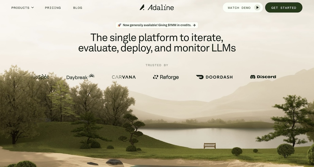
This one is wild. If you're looking for a SaaS website that nails both SaaS website best practices and pushes creative boundaries, Adaline is the perfect stylistic inspiration.
Adaline is a SaaS product that serves as an "end-to-end platform" (their words) for product and engineering teams building AI-powered applications. It helps teams iterate, evaluate, and monitor their LLMs (Large Language Models) all in one place.
What makes their SaaS website design so sick is the immersive experience. You're immediately hit with a intriguing loading screen, then the hero image section has a mind-blowing parallax scroll effect that transitions into a nature environment. It's the kind of bold design project that makes you keep scrolling and actually engage with the page.
The color schemes also blend naturally with the environmental theme, creating a cohesive earthy experience that drives user engagement from the first scroll to the last.
The navbar
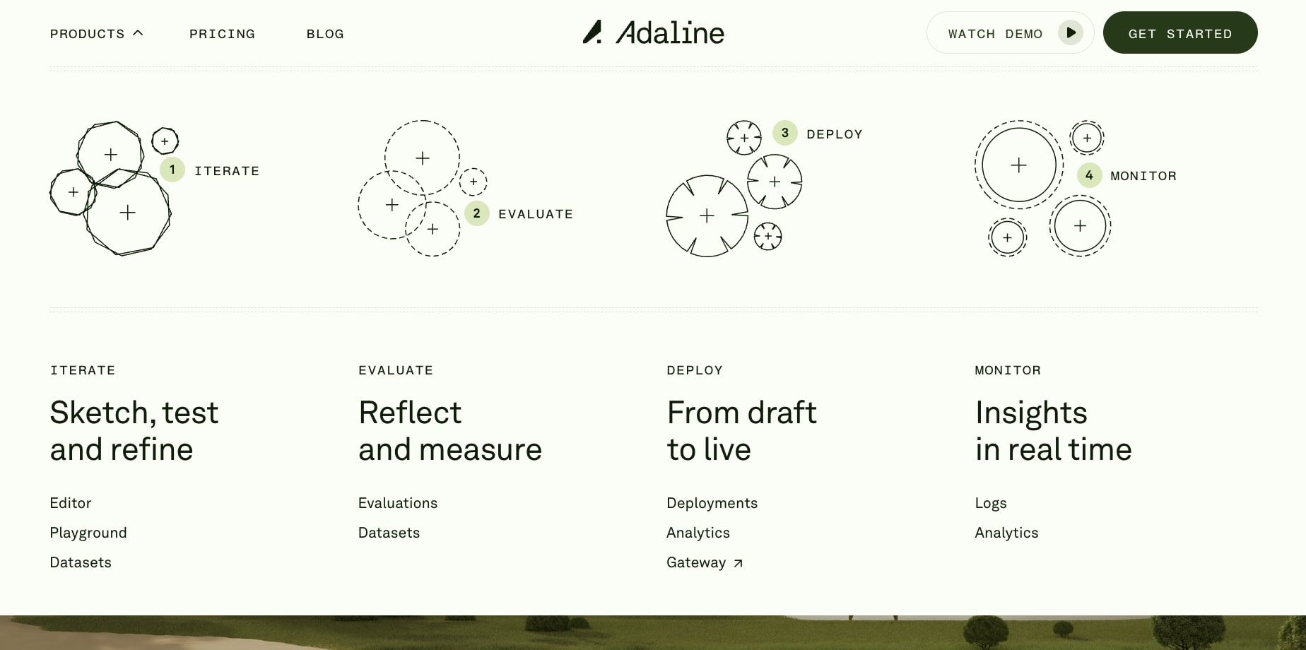
Adaline's navbar has a user-friendly design. It's clean, minimal, and purposeful — it doesn't overwhelm with complex dropdowns but still guides visitors to essential pages about the platform, feature suite, and resources. The call-to-action buttons are perfectly placed without disrupting the flow (with cool hover animations).
The pricing page
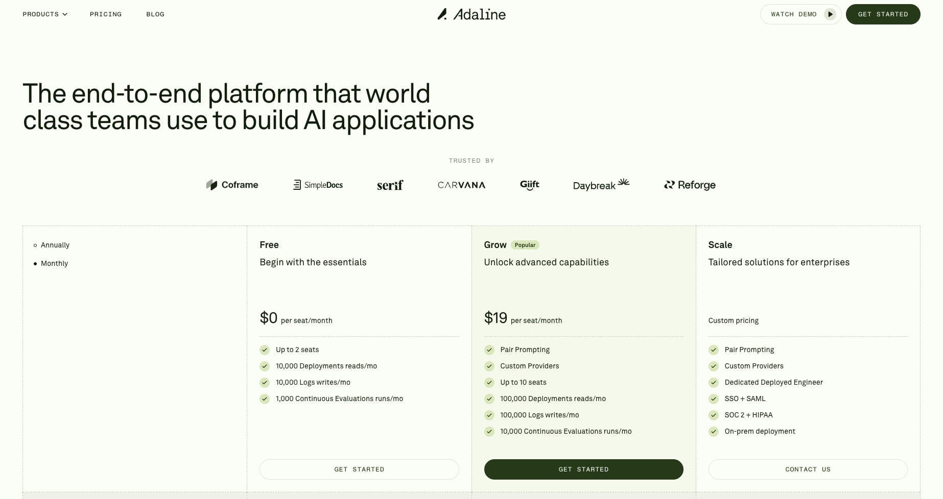
Adaline's pricing page is a masterclass in transparency and SaaS website best practices. They offer three clear tiers, Free, Grow, and Scale, with a detailed comparison table that breaks down exactly what you get. The toggle between monthly and annual pricing is smooth (although it is a bit hidden at first), and they're not afraid to show their usage-based pricing for additional deployments and evaluations.
This level of transparency help builds trust with visitors and helps potential customers make informed decisions without needing to "contact sales" for basic pricing info (which most SaaS sites do at this level).
The blog
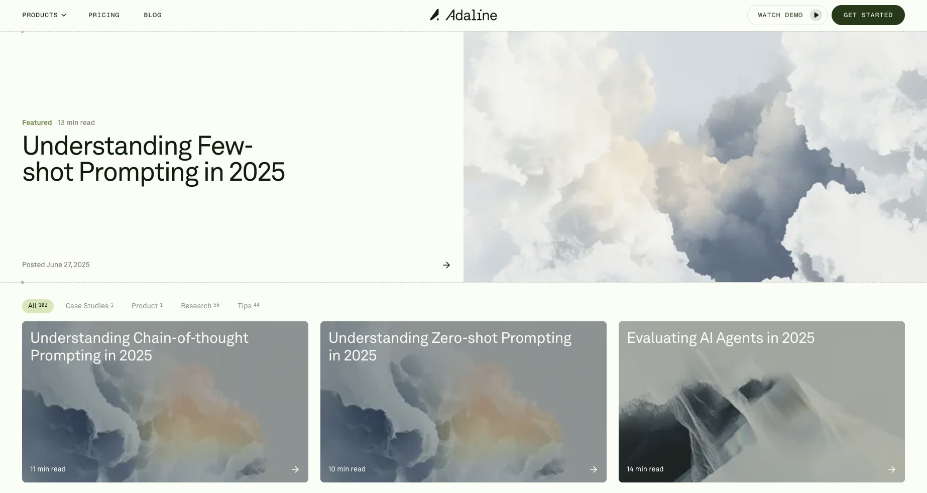
The Adaline blog takes a more refined, educational approach compared to typical SaaS blogs. Instead of dumping out SEO-focused AI slop content, they publish in-depth technical articles like their featured piece on "Understanding chain-of-thought prompting." The clean design and focus on quality over quantity shows they're targeting a sophisticated audience of AI practitioners who value deep insights over surface-level content.
What makes Adaline one of the best SaaS websites is how every element, from the nature-themed parallax effects to the transparent pricing to the thoughtful blog content, works together to create a consistent brand experience. The testimonials from Discord, Coframe, and McKinsey also add great social proof for larger companies that are interested in checking them out.
This SaaS website proves that enterprise B2B SaaS tools can push creative boundaries while not going overboard or confusing people. It's a masterclass in modern SaaS website design that other companies should absolutely gain inspiration from for their next design project.
2. Cofounder
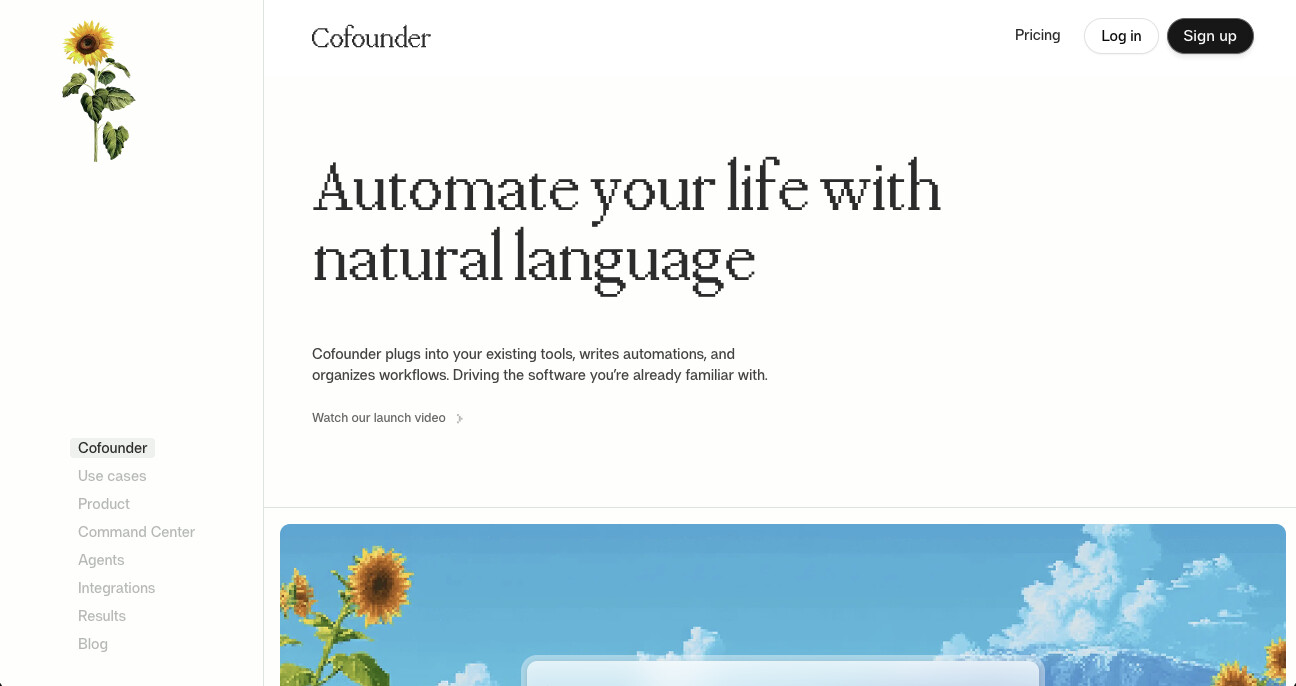
Cofounder is an automation platform built by The General Intelligence Company of New York. It lets you automate tasks using natural language, plugging into tools you already use like Slack, Linear, Notion, Gmail, and more.
The first thing you notice about this site is the 8-bit nature aesthetic. It gives the whole experience a unique, almost retro-game vibe that you don't really see on other SaaS websites. The hero section is clean with a button to watch their launch video, and below that you get interactive use case cards that actually show how the product works with live replay links.
I love the sharp typography, plenty of whitespace, and a "Made with love in New York" footer stamp in this design. It really makes me miss living in NYC.
The navbar
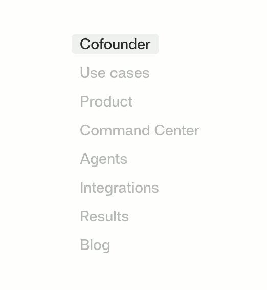
Cofounder takes an unconventional approach with their navbar. Instead of the typical horizontal top navigation, they use a left sidebar. It's not something you see often on SaaS websites, but it works here. It's tasteful, clean, and doesn't get in the way of the content.
The pricing page
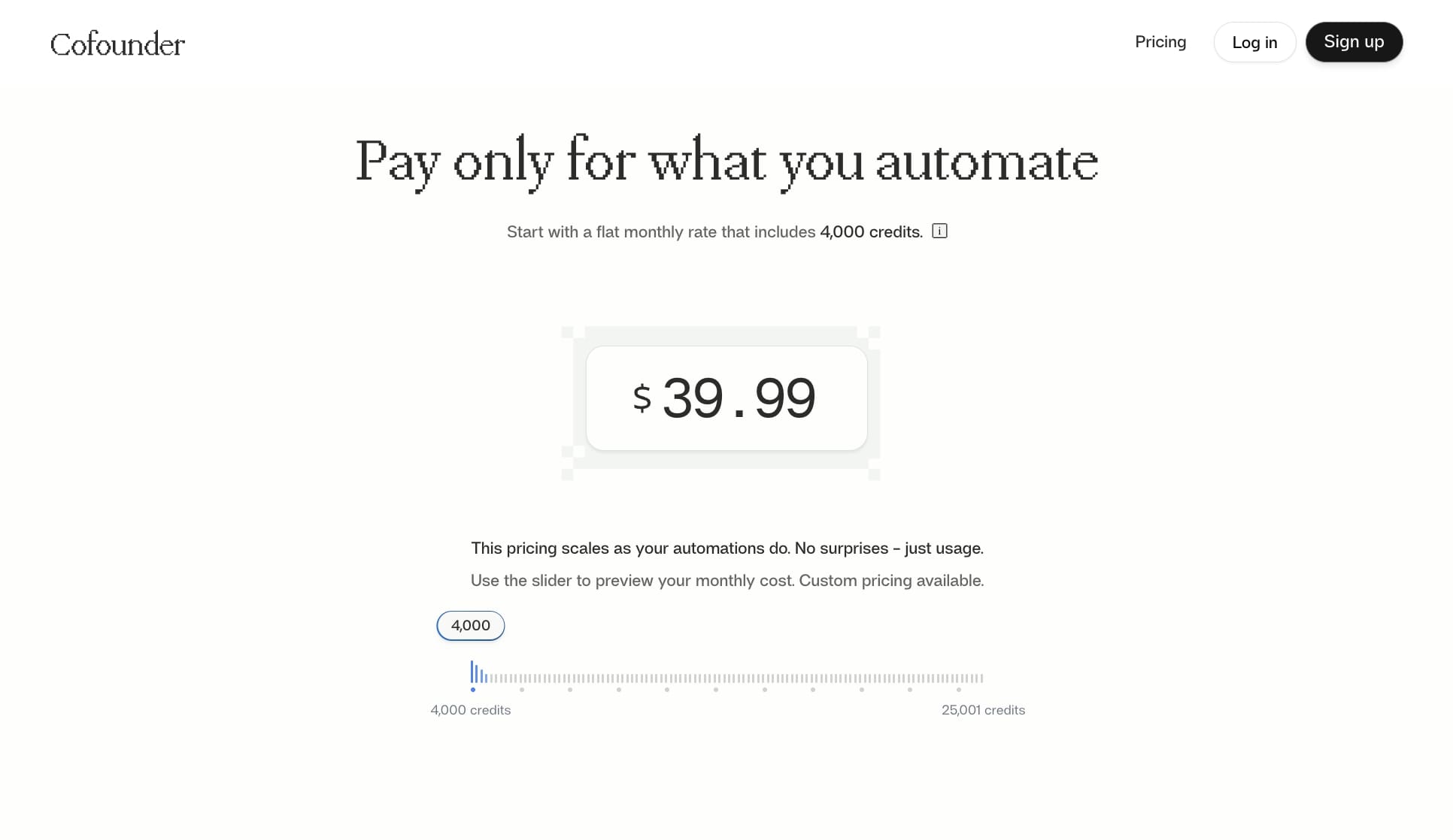
Cofounder's pricing is a pay-as-you-go model. There's just one pricing tier at the top of the page with a slider that adjusts the price up or down based on usage. There's no cards for feature plans or gating on price information.You just move the slider and see what you'd pay. It's one of the more straightforward pricing setups on this list.
The blog
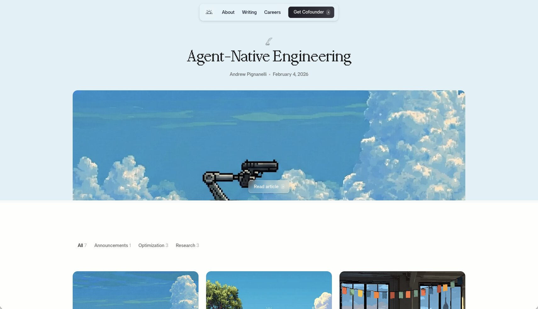
The blog lives on the parent company's site at General Intelligence Company. They call it "Writing" instead of "Blog" which fits their brand. The layout is simple but elegant, and the blog thumbnail images are super on brand with that same playful, video game nostalgic feel you get from the rest of the site.
The articles lean more technical and thought-leadership focused, covering topics like AI memory systems and agentic organizational management. It's a good example of a SaaS company using a parent brand's blog to publish deeper content while keeping the product site focused on conversion.
3. Wispr Flow
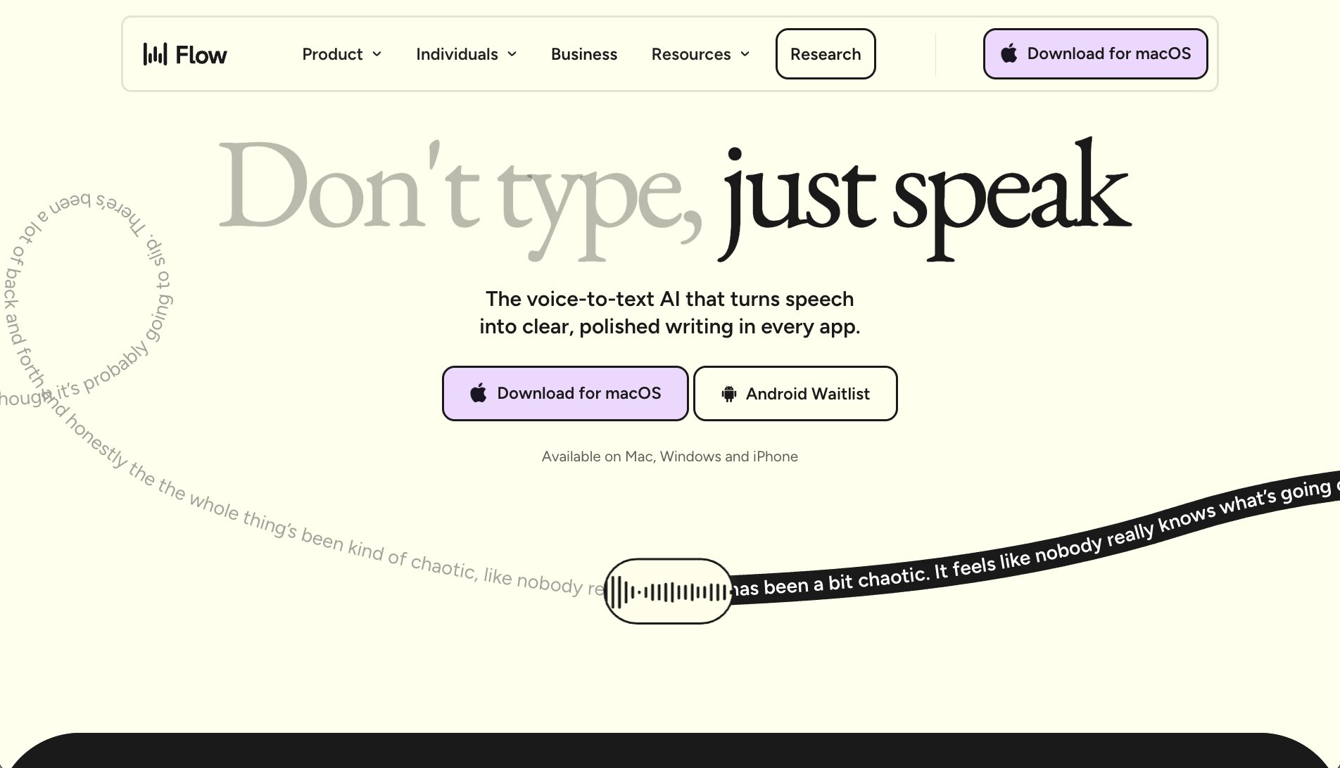
Wispr Flow is a voice dictation tool that turns your speech into clean, polished text across any app. Think voice-to-text, but one that actually works well.
The homepage is visually engaging. There's this animated squiggly waveform line running across the hero section that mimics voice dictation in real time.
There's actually some subtle psychology at play here. Humans are naturally drawn to watching squiggly lines move (some say it goes back to evolution and watching out for snakes). Whatever the reason, it grabs your attention and keeps your eyes on the page. They do push the animation pretty hard, and they could probably tone it down a bit. But I think they're really trying to sell the idea that your voice flows into text. It is called "Flow" after all.
The colors are fun and playful, and the overall brand feels young and energetic. They also have strong social proof with logos from companies like OpenAI, Amazon, Nvidia, and Vercel, plus some great testimonials from real users.
The navbar
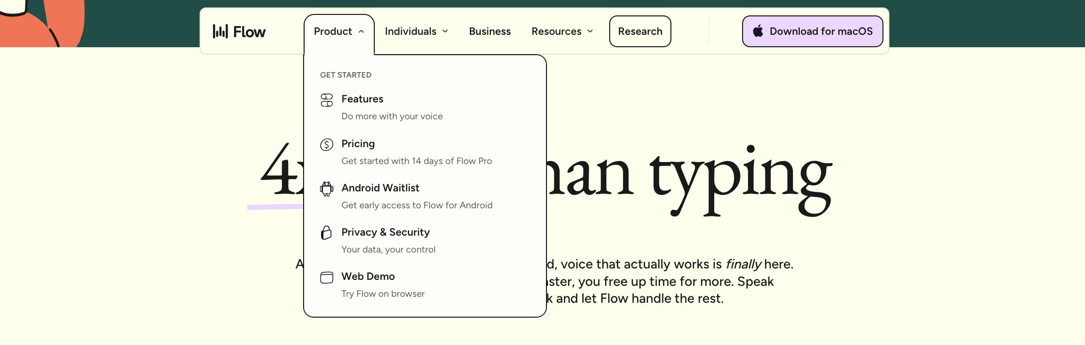
The navbar is clean and easy to understand. They have a Product dropdown, an Individuals dropdown that breaks out use cases by persona (developers, creators, sales, students, lawyers), a Business link, and a Resources dropdown. Everything is where you'd expect it to be.
One interesting choice is that they hide the pricing page inside the Product dropdown instead of giving it its own top-level link in the nav. Most SaaS websites put pricing front and center, so burying it in a dropdown is a bold move. It could mean some visitors miss it entirely.
The pricing page
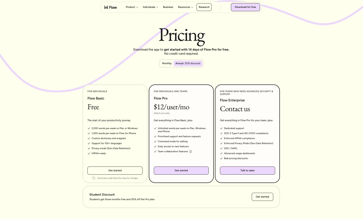
The pricing page itself is a classic SaaS setup. Clean tiers, clear feature breakdowns, and a 14-day free trial of their Pro plan. Nothing crazy here, but it gets the job done.
The blog
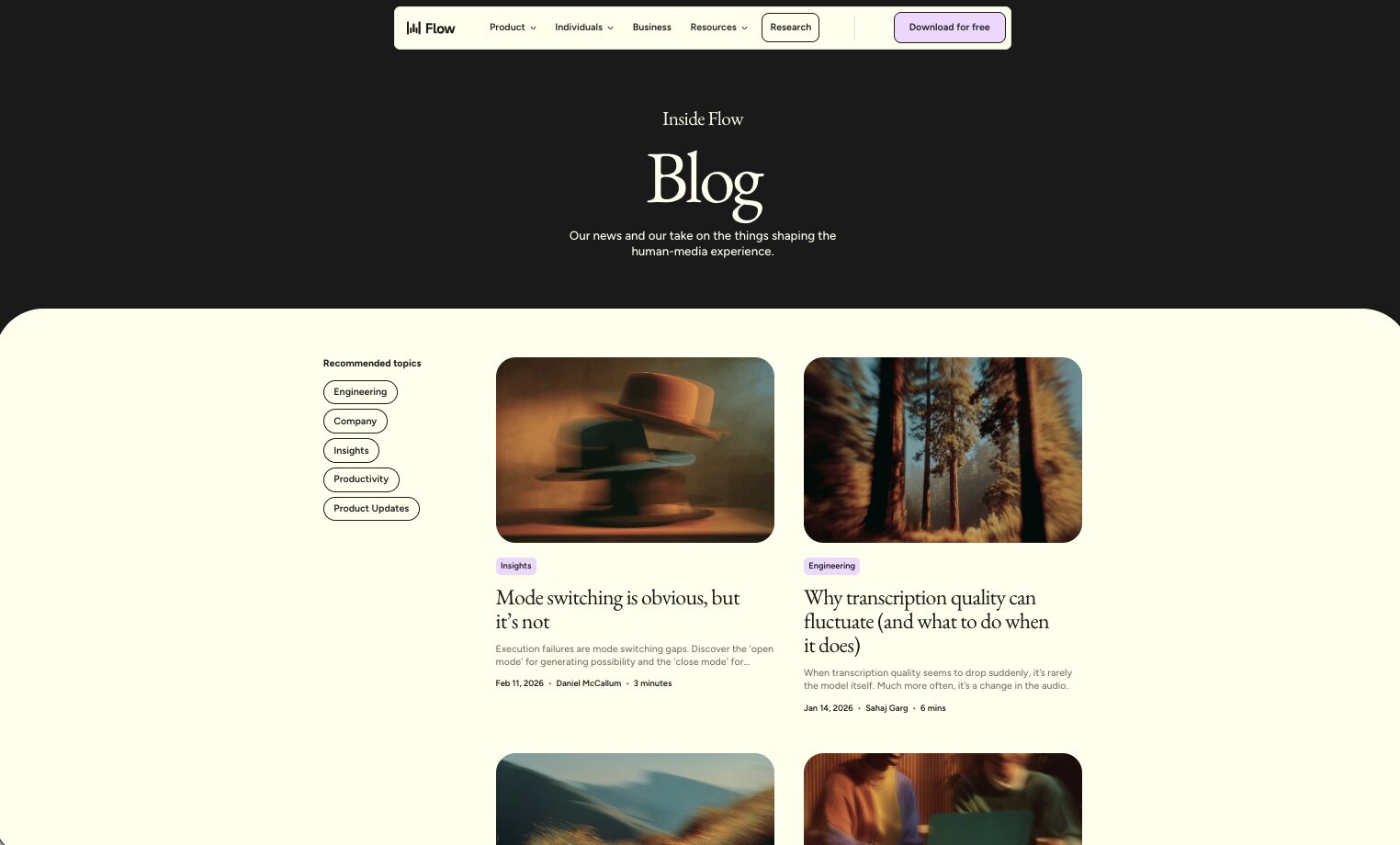
The blog is tasteful and well-organized. They have recommended category tags at the top so you can filter by topic, and the overall layout is clean without being boring. The blog thumbnail images are also on brand and consistent (and don't look like AI slop), which is something a lot of SaaS blogs overlook. Small details like that make the whole experience feel more polished.
4. Ghost
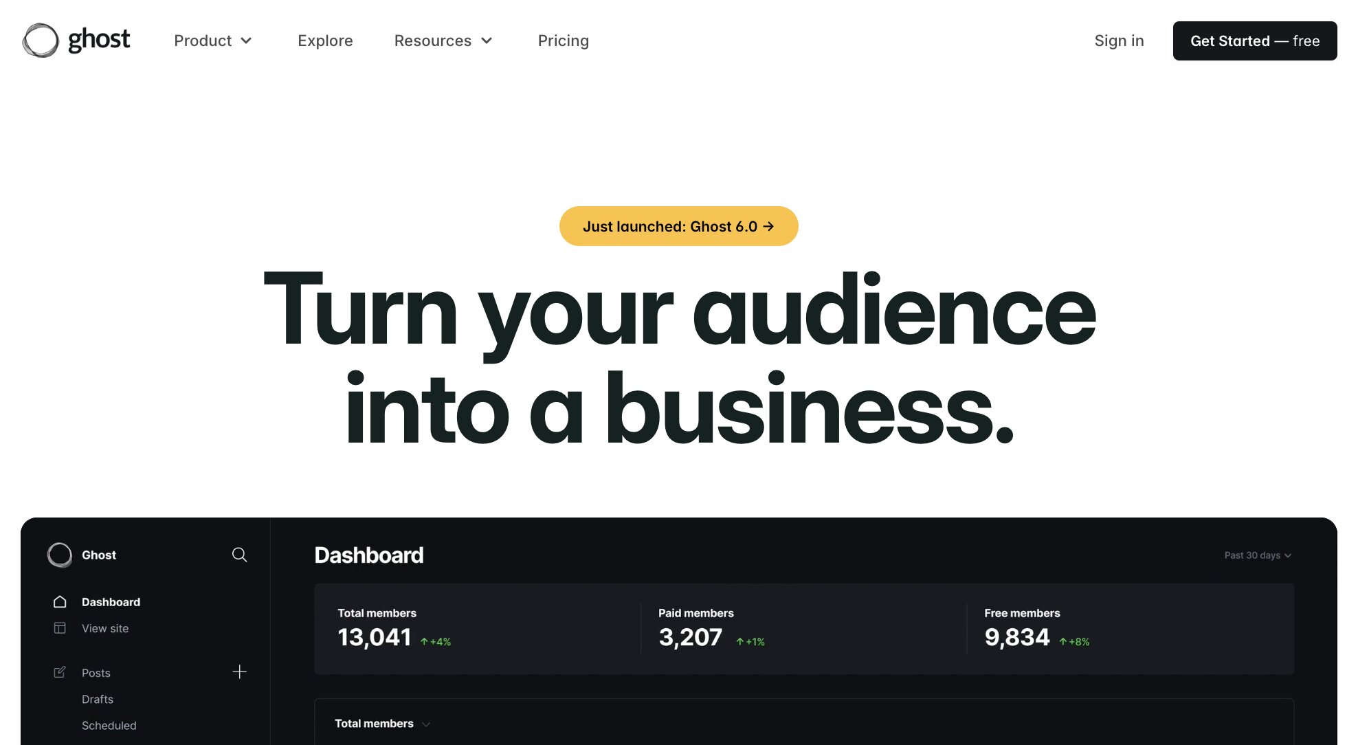
Ghost used to just be a CMS alternative to WordPress for blog posts, but now it's turned into a full media and newsletter platform. With this shift has come a brand new SaaS website.
If you’re looking for a newsletter platform, Ghost is one of the best. But we’re not here to talk too much about what Ghost does. We are here to look at their website and learn from it.
Let’s go over some of its pages.
The navbar

Ghost’s navbar is simple and clean. It has two different drop-downs — one for its use case pages and one for its resource hub.
The blog
The resource hub structure is great, and it even has a ‘Start here’ landing page to help its website visitors learn how to use the platform. In fact, the start here page acts as their blog.

However, it’s probably best to structure a blog on a /blog/ subfolder for a better user experience.
The pricing page

Ghost’s pricing page is a good example of what a SaaS website’s pricing should look like. It has clear pricing tiers, with CTAs, and a slider to help you understand costs associated with each plan as you grow.
The slider feature is great to have, but it only makes sense for some SaaS business models. In some other examples we’ll go over, you’ll notice some other SaaS websites have even simpler pricing pages because of their business model.
5. Ramp
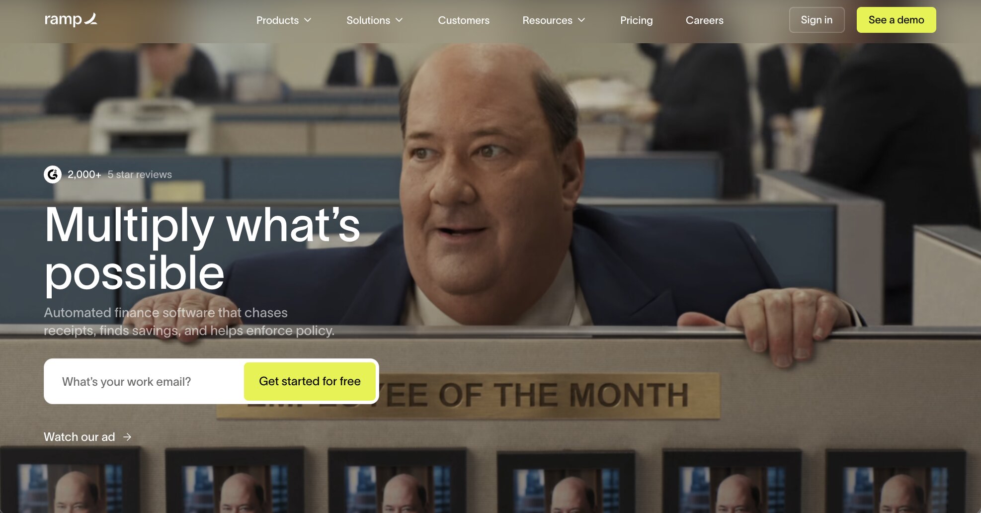
Next on the list is Ramp. Ramp is a corporate credit card company with a beautiful SaaS website (that’s built with Webflow).
The Ramp website is clean, airy, and does a great job of explaining what the product does and who it’s for.
Let’s go over some qualities that make Ramp have a great SaaS website.
The navbar

The navbar has several different drop-down menus, each with its own purpose. All of the landing pages in the navbar either explain Ramp’s features or its different use cases.
On the right side of the navbar, you can see a ‘Resource’ link that sends you to the blog.
The blog

The blog design is clean and accessible. However, just like the example before this one, the blog ideally should live in the /blog/ subfolder for user experience and SEO.
When you click on an article, you can see that it lives in a /blog/ subfolder. But ideally, ramp.com/blog would lead you to all of their articles. Currently, it redirects you to an /article/ page which is not ideal because there is no consistency. Just something to learn from when creating your SaaS website.
When it comes to design though, Ramp is a great example to look at.
The pricing page

Because Ramp is made for enterprises, its pricing is not shown like most SaaS marketing websites. However, they do do a good job of convincing you that it’s worth entering your email to get more information.
This is a good strategy for enterprise companies to collect data on who is interested in using their product. But for this strategy to work, you need a pricing landing page that converts well. Most of the time, people will bounce from a pricing page if they can’t clearly see the price.
6. ClickUp
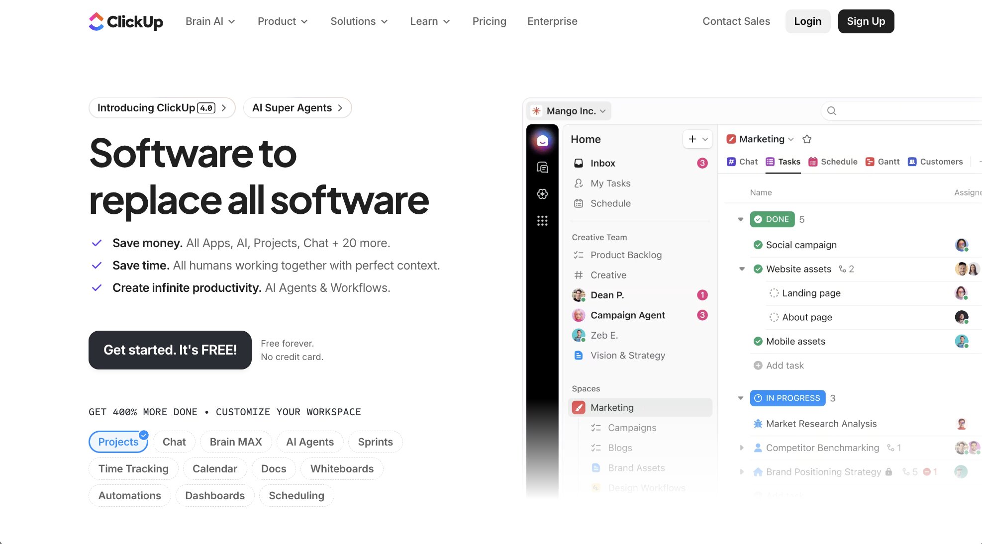
ClickUp is a project management tool. It has a lot of features compared to most SaaS products, which will naturally give its marketing site a lot of opportunity to create different types of landing pages.
ClickUp is a great example to look at if you’re focused heavily on SaaS SEO. They have tons of landing pages designed specifically to rank in Google.
The navbar

ClickUp’s navbar is full of content. However, they do an amazing job of categorizing all of their landing pages in an easy-to-understand way.
Drop-down menus are clearly labeled so website visitors can easily see their product features, use cases, and resource hub.
The blog

The ClickUp blog is also structured very nicely. They have a clear CTA in the header of their blog homepage web design, along with articles that lead to a beautiful article page with a table of contents.
If you’re looking for inspiration on not just design, but structure, ClickUp is one of the best.
The footer

We haven’t mentioned footer’s in the above examples, but ClickUp is one to check out because it sets a standard for what a SaaS website footer should look like.
They include all of their important links, along with a ‘VS’ section that compares them against their competitors. These VS pages also rank well in Google. So when people are researching ClickUp to make a purchasing decision, ClickUp’s VS landing pages show up in search engines.
The pricing page

Pricing is clearly laid out on ClickUp’s pricing page. It’s a good example of what most SaaS pricing pages look like.
Simple pricing tiers, no sliders, and what you see is what you get — very easy for website visitors to understand.
7. Assembly
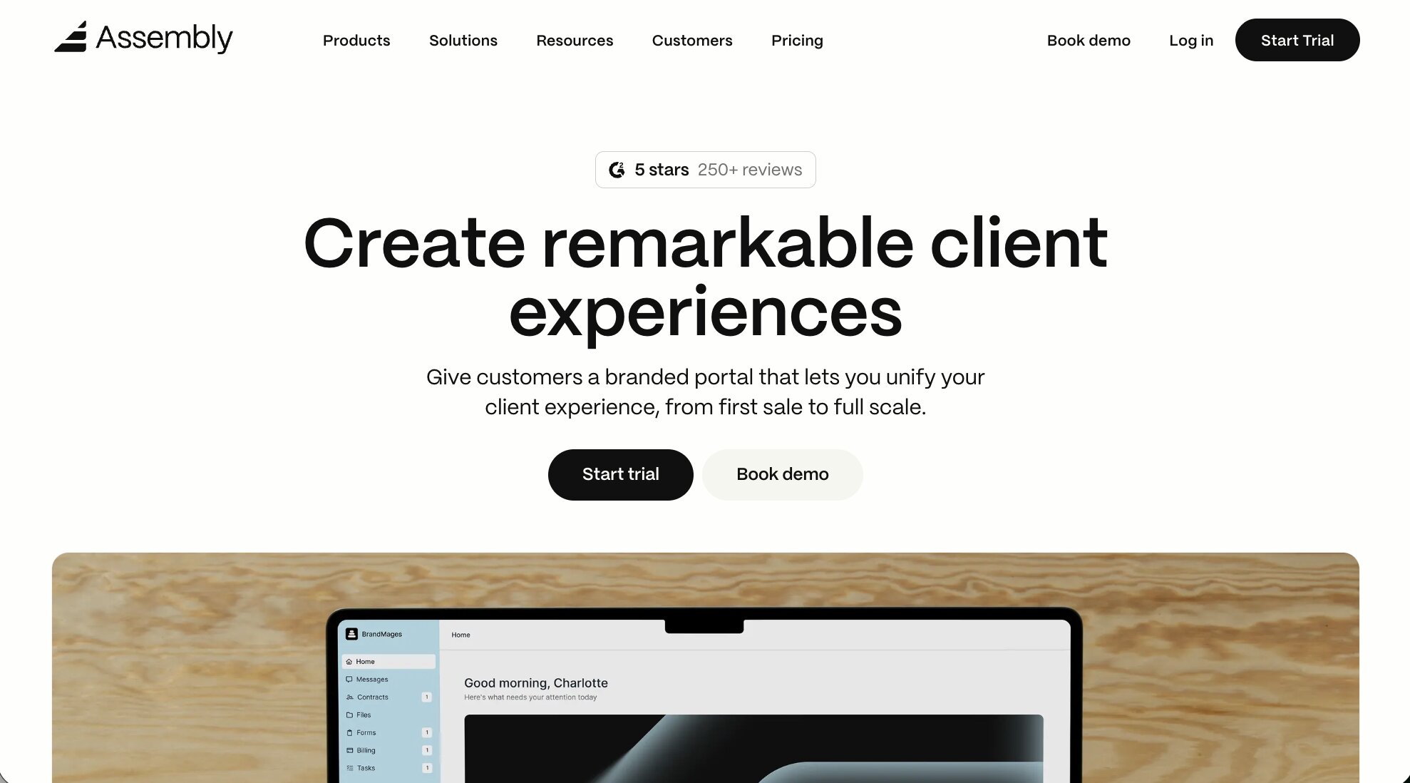
Assembly (formerly Copilot) is a SaaS platform that helps service providers run, manage, and grow their business. It's a one-stop-shop platform for created a branded client portal that can streamline everything from communication to payments and reporting.
What makes Assembly stand out as a great SaaS website is it's simplicity in design and clarity in messaging. Right when you land on the homepage you're greeted with an H1 heading that states Assembly's value prop — run a modern service-based business.
There's also a demo video, social proof, feature highlights, and extra resources that you can check out.
The navbar
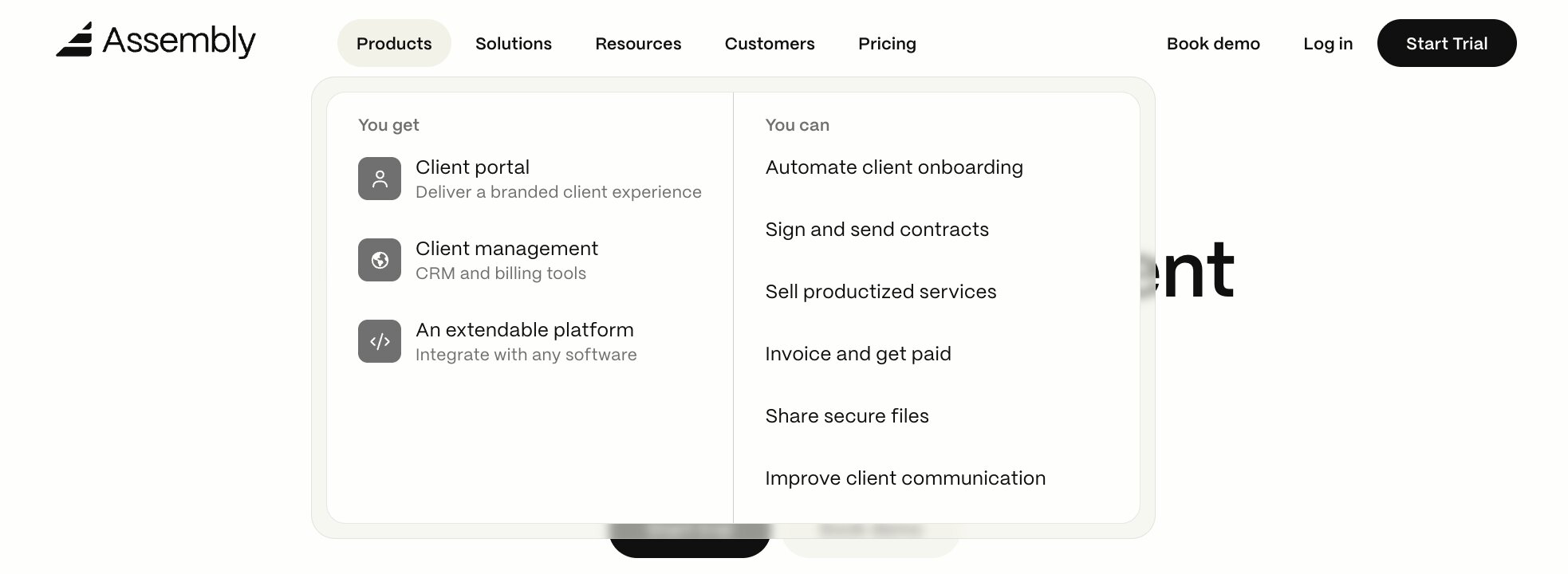
Assembly has a great navbar that many SaaS companies can learn from. It's simple, but includes everything that should be in a SaaS navbar — feature pages, use case pages, pricing page, and company resources like a blog.
If you're looking to create a navbar with all the essentials, Assembly's is definitely one you should check out.
The blog
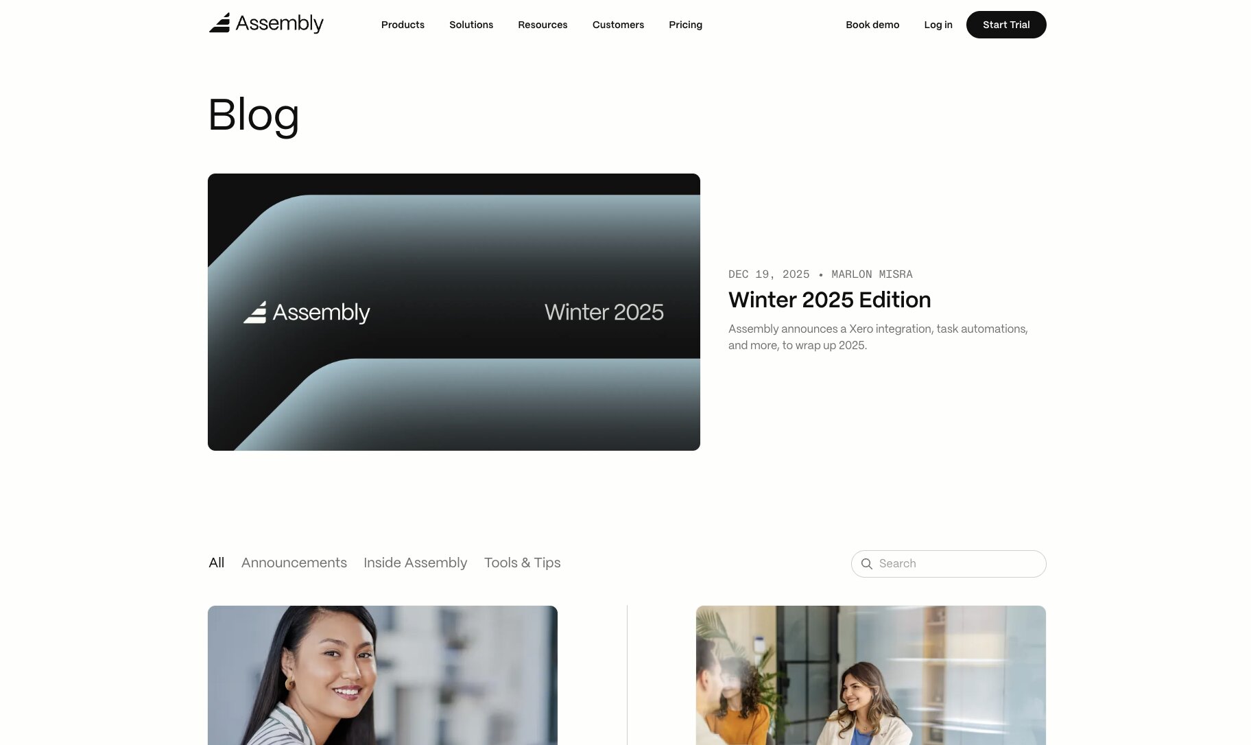
One of the great things about Assembly is how clean the blog article pages are. Each Assembly blog post has a table of contents and a great style guide that makes it easy to read different headings, subheadings, and paragraphs.
The pricing page
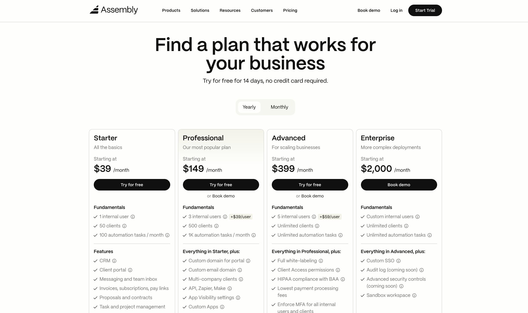
Assembly's pricing page is clear and simple. There's lots of whitespace which makes it easy on the eyes. It's also very clear from a UI/UX perspective — clearly showing the differences between different Copilot pricing plans.
8. Welcome

A clean modern design that's simple yet elegant — that's the feeling I get when I land on Welcome's site.
Welcome is an award-winning webinar and virtual event platform designed for marketing teams to host astonishing live experiences that drive revenue.
What makes this SaaS website so great is that, right when you land on their homepage, you automatically know what the platform does and how it differs from other webinar software on the market.
They have a great "how it works" video in the hero section, and as you scroll through the homepage you can tell this a premium product for serious brands.
The pricing page

Welcome has one of the coolest pricing pages out of any SaaS website on our list.
It's clear that Welcome is a premium product and they know their target audience quite well. They do lean more on the enterprise side so you don't get a lot of transparency on pricing (except for their Starter plan) as it probably depends on how many events you run, how long they are, and how many users you need.
The great thing about this pricing page is that, as you scroll down, you're greeted with an FAQ section that aims at addressing any potential customer questions or concerns — something many SaaS companies can learn from.
From design to copy, this is a website you should consider checking out if you want to create a SaaS website that aims at giving off a great first impression.
9. Spline

Spline is a design tool that makes it easy to create 3D animations and graphics. It has a clean and tech-like feeling to it — perfect for its ideal target audience.
The homepage is fun and interactive and does a great job of showing what the tool is capable of. After all, it is used to create 3D designs, so showing that in the homepage is a great way to get people interested in signing up.
The navbar is clean, with no drop-downs. They just have a feature page, a community link that redirects to Discord, their Twitter page, and a documentation page.

Their documentation page redirects to a Notion-style landing page that acts as their resource hub. It’s not an ideal setup for most SaaS websites, but it can give you some inspiration if your product is still in its early stages and isn’t ready for a comprehensive SaaS website just yet.
10. Webflow
Webflow is a SaaS product for creating custom websites without needing to code. It’s actually one of the best examples on our list as it fulfills all the requirements mentioned in the section above.
Started in 2013, Webflow is the leading no-code website builder for designers, developers, and marketers. It recently reached a $4B valuation based on its revenue numbers and the money it has raised from outside funding.
What makes this SaaS website great is its attention to brand and really knowing who its ideal customer is. Chances are, if you’re reading this, Webflow will be a great no-code platform to build your SaaS website with.
Many designers and developers use Webflow to create their SaaS website and we wrote a full Webflow review if you want to check out and see what it can do for your website.
Let’s go over some things that make this a great SaaS website.
The navbar
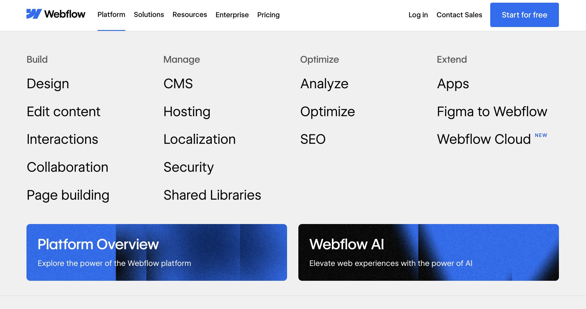
Webflow has an intuitive navbar that links out to all of its different landing pages. It’s a great example to look at if you’re looking for navbar inspiration.
The blog
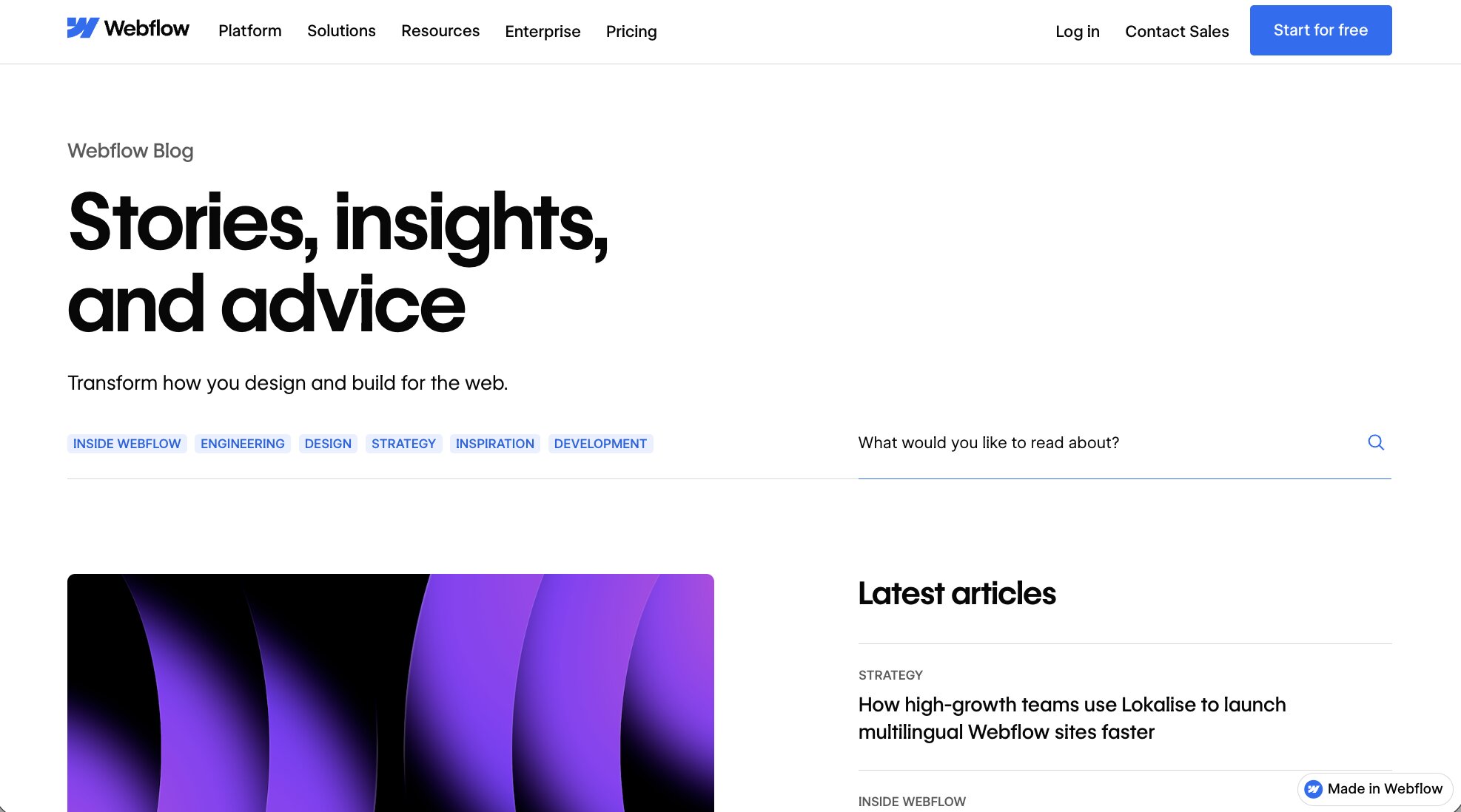
Webflow has a blog that has a slightly different design from the rest of its website. This is because the Webflow blog acts as a media arm to the company. It’s meant to attract designers and developers through thought leadership and SEO-focused content.
The pricing page
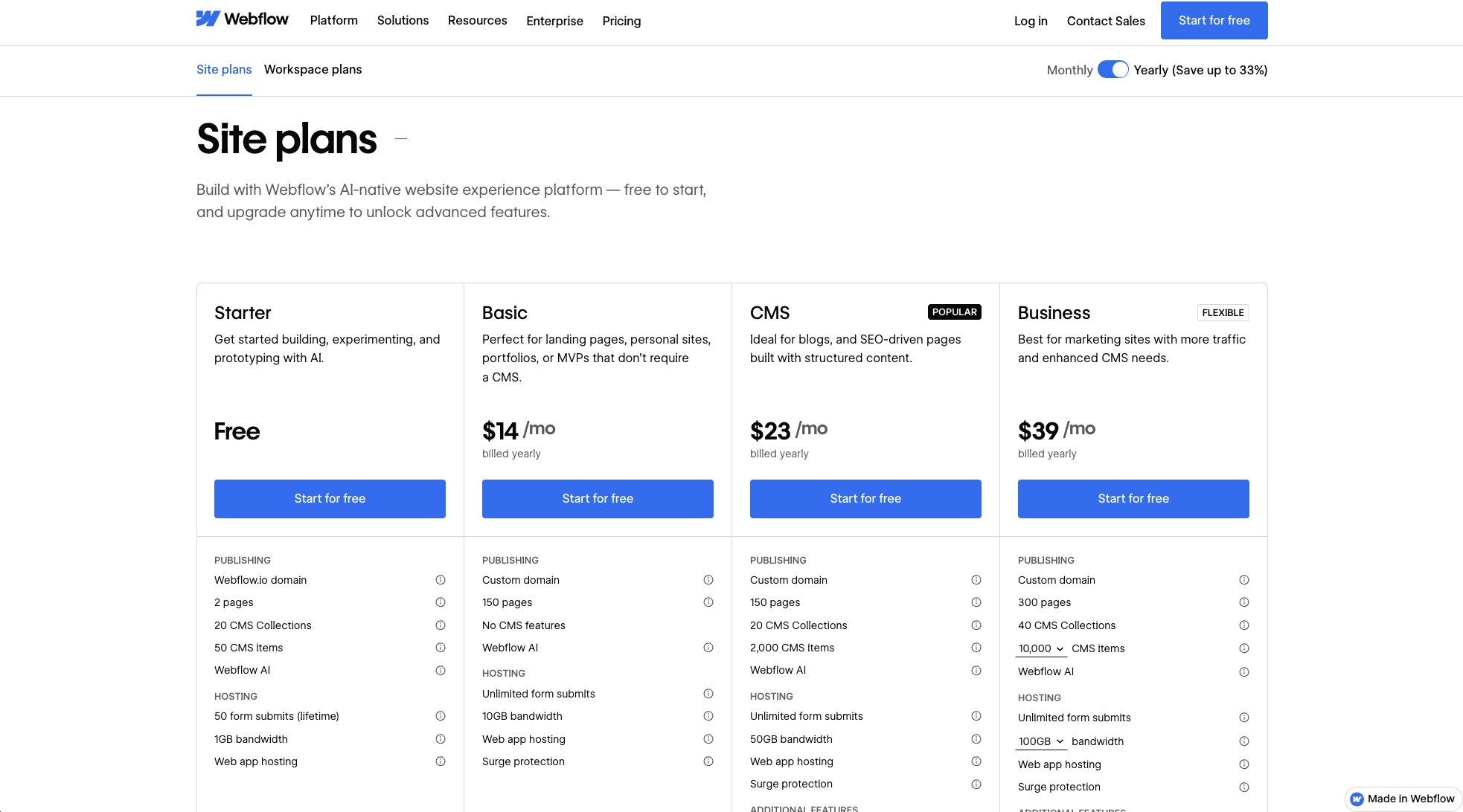
Webflow’s pricing page is a little complex compared to other SaaS websites. This is mainly due to the fact that its pricing model is pretty advanced. There’s a lot going on when it comes to pricing plans for Webflow. So, naturally, the pricing page is going to be a little overwhelming to some users.
11. Butter

Butter is a tool that makes it easy to run a fun meeting with your team. It’s a great SaaS product, with an even better SaaS website.
In fact, it’s one of the best SaaS websites on this list because of how simple, yet effective, it is.
The homepage also includes lots of logos from their clients — giving it strong social proof for its website visitors.
The navbar

Butter’s navbar is a great example of what a simple SaaS navbar should look like. They have a ‘Features’ drop-down menu that goes over all of the product features Butter has to offer.
There’s also a link to their templates, pricing, blog, and community landing pages.
The blog

The Butter blog has a fun and colorful web design and gives you category tags that allow you to easily bounce between different blog topics.
The pricing page

Butter’s pricing page is another SaaS pricing page standard. It gives visitors simple and easy-to-understand pricing, with a toggle to bounce between monthly and annual plans.
The copy on the page is also on brand — playing on the word “butter.”
This pricing page also has an FAQ section at the bottom — a key lesson other SaaS websites can learn from. Addressing potential questions and concerns a customer may have before they purchase a plan can be a great way to boost conversions.
12. Juno

Juno is a SaaS website that helps companies reward their employees. They empower businesses to give their employees flexible benefits. I read that on their about page — see how important it is to be clear with your messaging and include an about page?
Their website design plays on a fun and colorful vibe, while still looking professional through ample white space and clean typography.
They also have a list of their customers on their homepage, boosting social proof.
The navbar

Juno’s navbar is nice, but it’s also not the best we’ve seen. They do a great job of showing the features their platform has to offer through a drop-down menu.
But they bundle their resources into their ‘About’ drop-down. This could lead to confusion for some visitors and doesn’t clearly show all of the resources Juno has to offer.
The pricing page

Juno’s pricing page is similar to that of Butter’s — it’s clean and easy to understand.
They even include a checklist of what each plan has to offer, making it easier to make a decision on what plan to pick.
The blog

Juno’s blog is a standard for most SaaS websites. They do a good job of proper URL structures by using the /blog/ subfolder for both their blog homepage and their individual blog posts.
They also have their podcast episodes embedded on the blog homepage. However, if they created a dedicated landing page for their podcast, and placed that landing page in their navbar or resource center drop-down, it would bring more visibility to new website visitors.
Nevertheless, this is a great website to gain inspiration from.
13. tranch

tranch is a SaaS product that makes expense financing for growing businesses easy.
This fintech SaaS website is a great example of using a playful design to talk about an otherwise serious topic — money.
The whitespace, paired with dashes of bright colors, makes the typography and graphics stand out on the homepage.
Their website navbar is quite simple, but gives you enough information to learn about its features and use cases.
There is no blog however, at least not one that I could find easily. There also is no pricing page, which can be a concern for some visitors. However, it does look like that the main CTA is to start now and tranch is just looking to see who is actually interested in the product before they give them more information.
One aspect of this website, however, that is done very well is the FAQ page.
The FAQ page

Most SaaS websites don’t have an FAQ page. However, tranch decided to dedicate some effort into making sure that potential customers’ concerns are easily addressed.
The FAQ page addresses a lot of questions, and they’re nicely categorized by topics that you can click on — something a lot of SaaS companies can learn from.
14. Pipe

Pipe is a SaaS platform that makes it easy for startups to find financing and raise money. It’s a platform that is growing rapidly at the time of writing this article.
Their website (built in Webflow) is also one that is clean and minimal. I would put it in the category of “best SaaS websites with minimal web designs.”
The homepage gives you everything from social proof, what the product does, how it works, potential concerns, and a CTA to start now. It’s a grade A example of what a SaaS homepage should look like.
The navbar

Pipe’s navbar is simple. It includes all the important links on their website — product features, use cases, resources, pricing, and company information.
At a first glance, the links in the navbar just look like links. But when you hover over them, you’ll notice that they’re actually drop-down menus.
It’s great that they went with the drop-down approach, but the fact that there is no icon that shows they’re drop-down menus can confuse some users. They do include drop-down arrows on the mobile version of the site, so I’m not sure why they don’t include it on the desktop version.
They also have their important resource like their blog within the ‘Company’ drop-down. It could confuse some people because the first instinct is that the blog would live under the ‘Resources’ drop-down.
Nevertheless, they do have important resources on their site.
The blog also has a clean design, much like the rest of the SaaS website examples on this list. I won’t get too much into the blog, you can check it out here.
There also is no pricing page, which is probably because they do lean more enterprise.
15. Decodable

Decodable is a serverless data platform. It helps companies gather their data and build pipelines to see what’s going on as it pertains to data and analytics.
Their homepage is so clean, and the dash of color really makes it stand out. It does have a dark-mode feel, but that’s to be expected given that their target audience leans towards developers.
The navbar

The navbar is also well-equipped with all of Decodable’s important pages. I can’t say anything bad about how it’s set up.
The pricing page
Decodable’s pricing page is similar to that of many other SaaS websites. It shows you clear pricing tiers based on their business model, which seems to be based on how much the product is used.
The blog

Decodable’s blog is a grade A example of what a simple, yet stunning, SaaS blog design should look like.
In the hero section of the blog homepage, you can see a featured post along with different topics you can click on to filter blog posts by.
Individual blog post pages also have a clean design and great reading experience — equipped with a table of contents (something we could learn from).
16. Gumroad
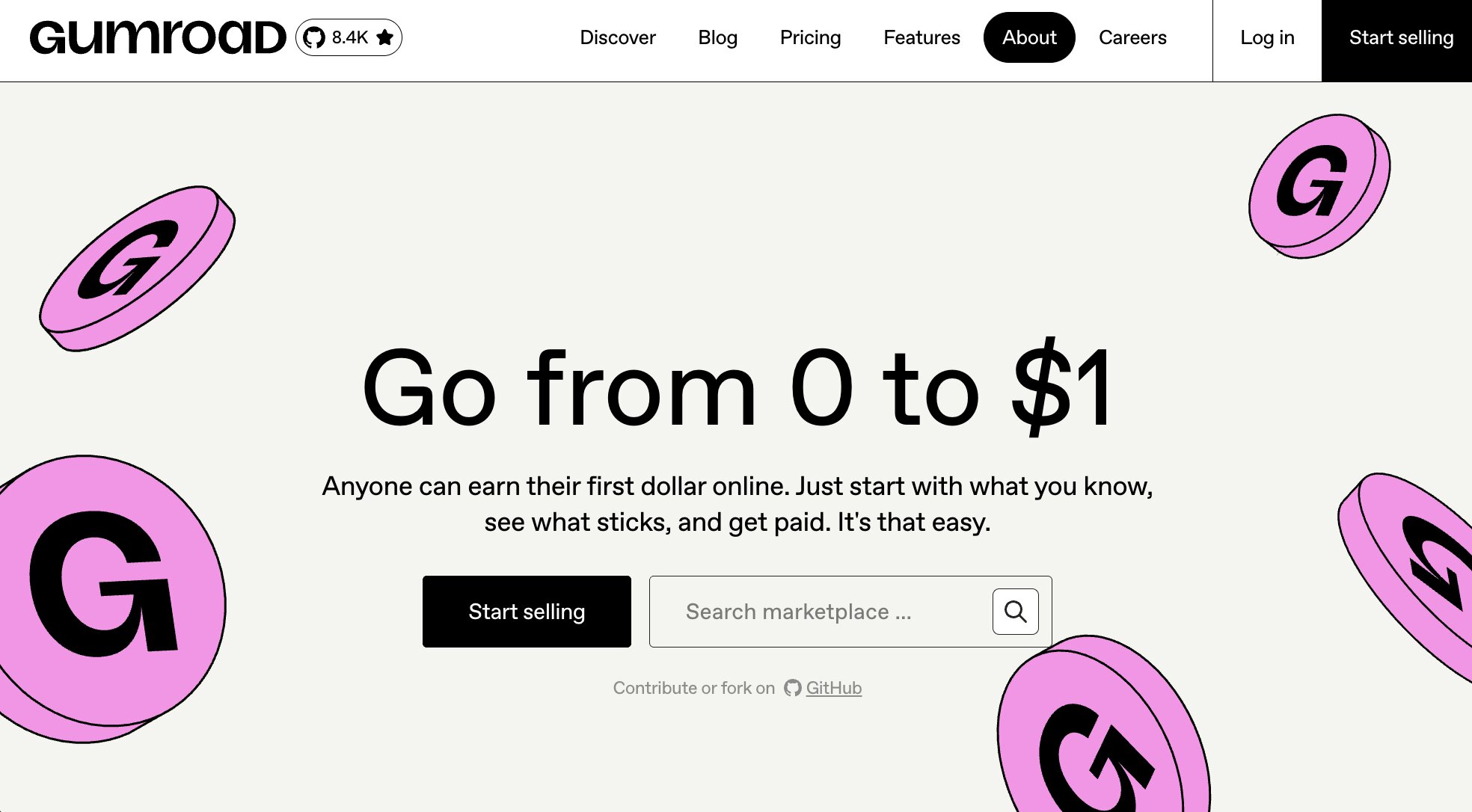
Gumroad is a platform that lets anyone create digital products and sell them online. They recently had a website redesign, and the new one is quite interesting (in a good way).
They take a slightly alternative approach to other SaaS websites. The Gumroad logo is at the front of the homepage, with the navbar located underneath it. Below that, you have a standard hero section with a CTA.
The entire homepage is very playful and fun, which plays to Gumroad’s brand. Their target audience can literally be anyone that wants to sell a digital product, and they do a good job of making sure their designs are accessible and inclusive.
The pricing page

Gumroad’s pricing is unique to most SaaS products. They only charge you when you actually make money through their platform.
So, on their pricing page, they show you how much of a revenue cut they take depending on the volume of sales you do. The more sales you make, the less of a fee you have to pay.
It’s a great pricing model because it eliminates any friction for anyone that wants to create a digital product. You only pay for Gumroad when you actually make money with Gumroad — brilliant.
17. Lattice

Lattice is a traditional B2B SaaS company that helps HR teams. It’s a people success platform designed to help companies keep their employees happy.
Their homepage avoids all the playful stuff a lot of SaaS websites have and, instead, focuses on copy.
Given the nature of the product, the navbar also has a ton of information and resources to learn more about the platform.
The navbar

The navbar includes all the necessary information for a website that is geared towards a wide range of industries and businesses.
This is a great SaaS navbar to look at when building out your SaaS website. They have all the right landing pages and they are categorized properly under each drop-down menu.
The pricing page

Pricing is clearly laid on their pricing page. There are also tons of resources to learn more or contact their sales department.
There’s also a chatbot that populates to talk specifically about pricing — a great addition for B2B SaaS websites that target other businesses.
18. Coherence

Coherence lets developers develop, test, and ship code. Their homepage takes elements of some of the other playful designs we’ve seen, while also incorporating developer-centered copy.
Most developer SaaS websites are dark and serious, but this one has decided to take a different route.
At the time of writing this, Coherence is in beta so their navbar is very simple and doesn’t include a lot of key elements seen in other SaaS websites. There also is no pricing page because you have to sign up to get beta access.
It’s a great example of a SaaS website that’s in its infancy stages — just a simple landing page that looks beautiful.
19. Jasper

Jasper is one of the best AI writer tools out there and it’s been growing rapidly in popularity. It helps marketers craft copy using the power of AI.
Type in a topic you want to talk about and Jasper’s AI will automatically write it for you using GTP-3 technology.
Their SaaS website is nothing short of amazing. The homepage is bold and includes a video that demonstrates how the product works. There’s also tons of social proof from testimonials to reviews from third-party platforms like G2 and Capterra.
After all, it's an AI marketing tool, and it’s created by marketers, so it’s no surprise that the marketing website is done extremely well.
The navbar

Jasper’s navbar has all the necessary tools and information about what the product is, who it's for, and how it works.
It’s a bit hard to read because the drop-down matches the same color as the homepage background, but it does include all the important information so I can’t complain there.
The pricing page

Similar to Ghost’s pricing page, Jasper has a simple tiered plan that changes based on a slider that you can play around with.
The more AI generated words you need, the more you pay. There's a lot of flexibility in their pricing model — making it easy for potential customers to only pay for what they need.
20. Homerun

Homerun is a SaaS platform for recruiters that makes it easy to organize everything during a hiring process.
Their SaaS website is clean and uses both bold colors and clean typography. It’s really pleasant on the eyes when scanning through — thanks to a lot of white space.
The navbar

Homerun also has a simple and realistic navbar. They leverage drop-downs and even have a resource hub called ‘Learn’ in their navbar. This is a great approach because it’s literal and makes it easy for anyone to understand that all content under that ‘Learn’ drop-down is educational material
The pricing page

Homerun’s pricing page is typical of a standard SaaS website. It has clear pricing tiers, with a toggle that switches between monthly and annual plans.
They also have an FAQ section at the bottom of their pricing page, which is a great addition that not many SaaS pricing pages have.
Honestly, this is a grade A pricing page for a SaaS company. If you’re building a SaaS website that has a simple product offering, this is one to definitely check out.
21. Pitch

Pitch is a collaborative presentation platform for teams. If I can recall, years back, their homepage was not common amongst most SaaS companies.
At a first glance, it looks like your typical modern SaaS homepage. But Pitch was one of the first companies to take this playful and clean approach. I’m sure a lot of other SaaS websites have gained inspiration from them.
The navbar

Their navbar is a standard amongst SaaS websites and includes everything from product features, use cases, templates and learning resources.
Again, it's one of those navbars you have to look at and give credit to. It’s seriously one you should check out and gain inspiration from.
The pricing page

Pitch’s pricing page is again a standard for SaaS websites. They have a clear pricing structure with just three plans — a Starter, Pro, and Enterprise.
They also include a lot of social proof and an FAQ section on their pricing page, which is an amazing touch. I told you Pitch has been leading the way for great SaaS websites.
22. Segment

Segment is arguably the best real-time customer data platform available right now. It’s a tool mainly for developers and data analysts to connect their data sources into one place.
The Segment SaaS website is also a great example of a customer analytics software website geared towards a more developer-heavy audience.
The homepage is easy to navigate and does a great job of promoting the main CTA, which is to book a demo.
The navbar

Segment’s navbar includes tons of important information. You can easily see their different product offerings, pricing, use cases by audience, and learning materials.
Most of the links in their navbar are drop-downs but, similar to a previous example we went over, they don’t show arrows indicating they’re drop-down menus. You have to hover over them to see the lists populate.
From a user experience standpoint, it’s probably better to highlight these as drop-downs. But, they do include key elements of a good SaaS website so I can’t complain too much there.
For the rest of the 10 best SaaS website designs we are about to go over, I’m going to stop showing screenshots of the navbar and pricing pages. Mainly to spare you extra scrolling and because it takes me a long time to source all of these images. My laziness is spared by letting you just click the link to the websites to check them out fully for yourself (don’t @ me).
23. beehiiv
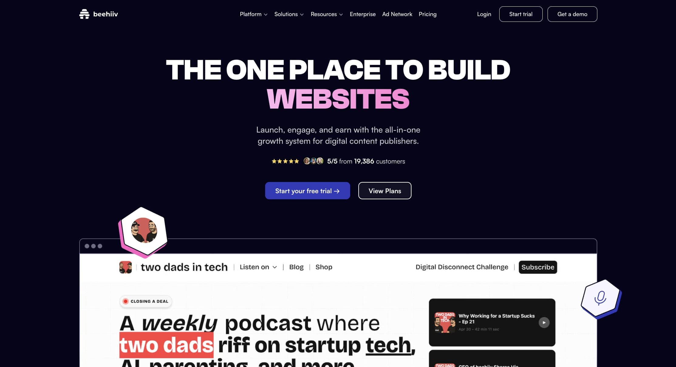
beehiiv is a newsletter platform designed for marketers and creators to build beautiful newsletters. It’s on the cutting edge of email marketing software.
I actually use beehiiv for my own newsletter which you can check out here.
I also wrote a full beehiiv review if you want to learn more about the platform and see what it can do for your business. This tool is seriously a great email marketing platform for any content-driven business.
beehiiv’s homepage makes a strong first impression. It’s clean, modern, and has a Web3 like feel (as it pertains to its color palette and design elements). It also has a clear value proposition — a newsletter platform built for growth.
They also have a clean navbar layout that explains all of beehiiv’s product features, along with a pricing page that’s easy to understand.
24. Basecamp

Basecamp is a project management and collaboration software. Whether you’re doing project management for a marketing strategy or a product launch, Basecamp is a valuable tool for those who want to stay organized in their day-to-day workflows.
The Basecamp homepage is fun, bold, and clean — all at the same time. They include tons of resources and social proof, making for a great SaaS web design.
The navbar is also quite different from most SaaS navbars. They only give you a few links that talk about what Basecamp is, life before and after using the tool, pricing, and a few other things.
Their pricing page is also different — they only have one plan. This can make it easy for anyone who wants to use the tool because they don’t have to think about what plan to use. It helps eliminate a lot of friction from cognitive load most pricing pages face. There’s also a free 30 day trial.
25. Method

Method is a fintech SaaS platform that makes it easy to pay your users’ debts. They’re a great example of what a simple fintech website should look like.
Their homepage is easy to navigate and doesn’t add extra design elements to try to prove a point — it’s simple and straightforward.
The navbar also has product features, use cases for different personas, and a pricing page. The entire marketing site has a great user interface that makes you want to browse around and learn more about the platform.
The pricing page is also simple, not common for most fintech SaaS websites. It only has three pricing tiers and there’s no extra information on the web page.
26. Softstart

Softstart is an employee onboarding platform that makes it easy to set up and engage new hires at a company.
Their website is a modern class amongst SaaS websites. Great typography, fun colors, ample whitespace, and great graphics can be found on their homepage.
The navbar is also very functional. There’s a drop-down menu for product features and links to their pricing page, blog, and about page.
The great thing about their homepage is that they showcase what their product actually looks like. This is a great strategy to get people who are on the fence to sign up and make an account.
The product screenshots clearly show that Softstart is a user-friendly platform and not one that recruiters or hiring managers should be intimidated by.
27. Framer

Framer is a web design tool and AI website builder for those who want to build custom websites without learning how to code.
They have a beautiful website that includes a video ad on what their product is and what it does. They also address how they’re different from competitors in the space, give lots of social proof, and website templates.
The whole site has an Apple-feel to it, giving it a really high quality look.
Framer’s navbar also is a great example for other SaaS websites to follow. It has clear use cases, pricing, resources, integrations, and more.
28. Attentive

Attentive is an SMS marketing platform for brands looking to connect with their customers via text messages.
Their website is colorful, clean, and well designed amongst other things. It truly is a great looking website. After all, I wouldn’t include it in an article about the best SaaS websites had it not fit those criterias.
The navbar includes links to product features, customer case studies, resources, and more.
Many of the links in the navbar are actually drop-down menus, but you have to click on them to populate. It would be nice if they dropped down when you hovered over them, but in a way it does help with web accessibility the way they have it set up.
29. Teachable

Teachable is a platform where people can create and sell their own online courses. It’s somewhat similar to Gumroad in a lot of ways, and the web design shows it.
Teachable has a beautiful SaaS website full of videos, case studies, social proof, and convincing copy.
Their navbar also includes all the elements of a proper SaaS navbar — showcasing product functionality, pricing, their blog, examples of courses, and resources.
30. Dropbox

Dropbox is a cloud storage solution that helps anyone keep their files organized in the cloud. From storing photos to creating company process documentation, you can do it all in Dropbox. It’s sort of like a cleaner alternative to Google Drive in many ways.
Dropbox is famously known for having a great design team and their homepage shows it. Dropbox is probably one of the first SaaS websites to use bold typography and large images.
The navbar is also interesting. It has a section for why you should use Dropbox, different feature sets, pricing, support, and more.
31. Mailchimp

Mailchimp is one of the most popular email marketing platforms out there. It’s used by millions of businesses to power their email marketing.
Their SaaS website is nothing short of amazing. They use beautiful typography, great colors, and ample white space to make it easy to read the website copy.
After all, it’s a tool made by marketers so it’s no surprise that their website is well equipped with all the necessary information needed to make a purchasing decision.
32. Slack
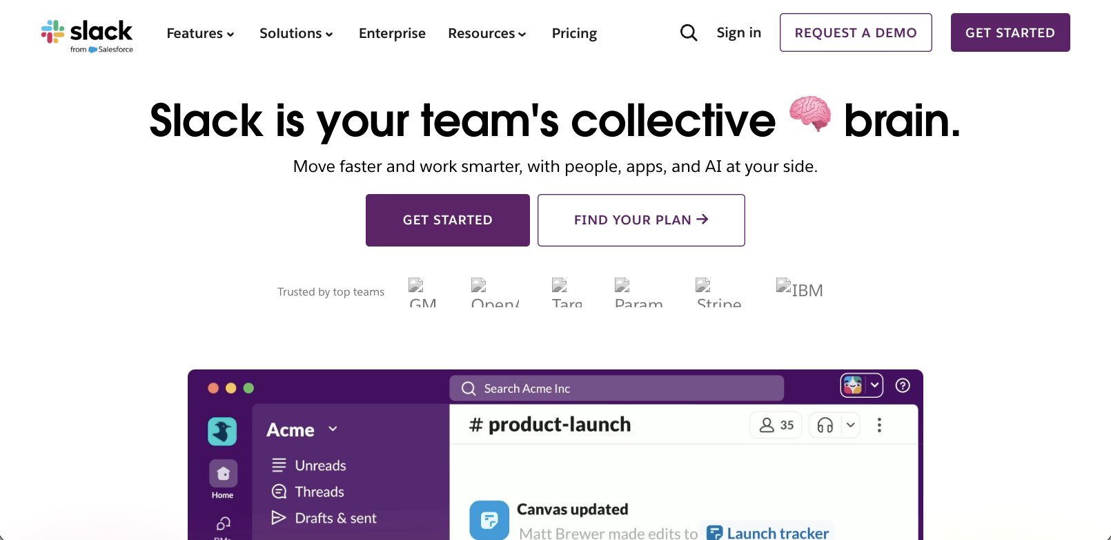
Last but not least, we have Slack. Slack is a message platform used by millions of people and businesses to communicate with their team members.
The Slack website uses a lot of different elements from other websites we talked about in this list. It’s very straightforward and doesn’t involve heavy graphics and unnecessary information.
You can tell that the design team that worked on the website had a lot of data to make sure that things were optimized for conversions.
They also have a great footer you should check out if you’re looking for footer inspiration and ClickUp’s footer was too overwhelming for you.
Okay, that’s it for our list of the best SaaS websites! Now, what is the best way to create a SaaS website?
Which is the best platform to create a SaaS website?
The best platform to create a beautiful SaaS website, like the examples we went over, would have to be Webflow.
Webflow is the leader in no-code website building and it’s a platform I seriously vouch for. I used it to build this entire website, and about half of the websites in this list were made with Webflow.
It’s super easy to create different designs, create landing pages, and create SEO-optimized content that ranks in Google.
If you’re on the fence on what platform you should use to create a SaaS website, I highly recommend it.
Anyways, I’m sure no one is reading this article at this point. Did I just waste six hours of my life writing this article? Ye.. of course not!
I had a blast going through all of these SaaS websites. And to be honest, it was hard to just list 32 of them. There are thousands of amazing SaaS websites out there.
Now go and create a beautiful SaaS website so I can add it to this list!
agree to our Terms.


Get the weekly newsletter keeping +33,000 marketers in the loop.